When you create a product you tend to see months and years into the future.
Inevitably you ask whether you can squeeze these new features into the product. It’s only natural to want to make it bigger and better. How could anyone beat us if we have all these features?
If you’re outsourcing development you’ll inevitably be told “sure, as long as you’re willing to pay for the extra work”, so you probably don’t do it. If you’re working with a developer as part of your founding team, they might feel your enthusiasm and say “sure, I can fit that in” believing it’ll make the product that much more awesome.
Everything is more work than you think it will be and you end up releasing a bloated product that doesn’t do any one thing incredibly well.
I was more guilty of this than anyone. As the product-focused person within the team my mind rushed to all of the things that we could do.
Wouldn’t it be awesome if we could just launch with that killer social feature so you can choose a close friend to go on a health kick with.
Wouldn’t it be awesome if we had that killer gamification system so users get a score of how healthy they’ve been on any given day.
I could list half a dozen things that weren’t part of the original plan that I added in with the blessing of our developer and team.
Over six months from the launch of BodyWise v2 and our training partners social feature doesn’t work. Our gamification system is 20% built.
The things we’ve worked on since are the things that we discovered really matter to users, not the things that we thought a mature product would have.
We’re playing catch up and working back from bloated to simple. It’s working and things are on the up for us but I learnt a big lesson on the importance of controlling scope in product development.
Choose where you start and where you stop. Think simpler early.
Too often good products fail because it takes too much effort to use a product and realise the value that the product designer envisaged.
You know it if you see it. Your app gets opened for the first time. The user hits a blank screen and explores whether pinching does anything, whether that heading is a button, whether the menu slides out. It might not be an app. They might wander into your store and walk out within ten seconds.
They explore looking for something that immediately hooks them.
Too often we’re left with the empty screen, or even something that looks like a working, finished product but doesn’t give me something truly great.
We’ve got so much choice that truly great is fast becoming the benchmark.
I know that BodyWise takes way too long to show value. We’ve improved it by syncing your steps immediately upon opening the app but there’s 5-10 mature products out there doing the same thing. Where’s the value? Where’s the wow?
Thats our next task – going from a stable, functional platform with some cool features if you invest enough time in it, to providing an awesome experience very early in your interaction with the product. If you can do that, the users more likely to stick around and find the extra value in using your product the way that you intended.
What if when you open BodyWise for the first time, it compares your activity to the rest of your country? “You’ve been more active than 82% of other Americans. Nice one! Log todays activity to take it to the next level.”
We just released a pretty major update to BodyWise v2. It’s an update that was designed with an incredible amount of thought and conjecture.
I’ve had 109 conversations with users over the past three months. Bit by bit I’ve learnt what frustrated them in our apps and generally how they keep track of their health & fitness. Some things confirmed my own instincts and frustrations. Others were new and cut pretty deep.
Update product design – It started with the problem
Bad reviews.
Disgruntled users.
Bug notifications.
Lack of traction.
Those are business problems.
The real problem lay in the product not solving the problem that it set out to solve. Our product wasn’t significantly helping people to live happier and healthier lives.
You can talk about being better than other technology or doing so via increased motivation or through the product educating them about healthy living, but simply it’s all about solving the primary problem.
It’s a young product so we try not to be too hard on ourselves but that has to be our primary consideration as a company.
Planning an update
The situation:
V1 had about 30,000 users over it’s 6 months. Logging data had a lot of friction, requiring you to log things manually. Lots of people loved the ability to track specific things that they couldn’t track with other apps but most gave up as technology evolved
V1 was local to the device. There was no sign-up
About 2,000 past users came across and signed up to V2
We were averaging about 70 new users per day and daily active users in the hundreds
Our average rating pre-update was close to 2/5. Many bad ratings due to FitBit/Jawbone UP bugs. Others due to clunkiness. It’s very easy to make fitness tracking cumbersome.
This update came about almost entirely from an exhaustive look at customer persona’s. Let me tell you as someone that has released a product that I wasn’t proud of that you need to look at your customer personas early on.
We fell into the trap of building a product too aligned to what we thought would be cool to use and week by week went further away from the problems that we were trying to solve for people wanting something better.
Dave (my co-founder) and I sat down one day and asked ourselves the hard questions. BodyWise v2 had been out for a few weeks. We launched saying that we’d help you get more out of your Fitbit or Jawbone UP. It was buggy as hell and didn’t really sync your data into BodyWise properly. That masked a gut feeling we started to develop that our product wasn’t good enough anyway.
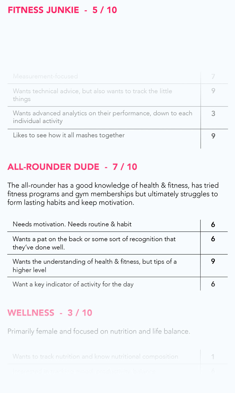
We broke our market into five personas
We listed the things that they cared about (unique and otherwise)
We rated how our product met those needs
We gave each persona an overall rating out of ten
“So, we’ve got some seriously bloody work to do”.
Revisiting our customer personas and rating how our product fit specific needs was the best thing that we did. It’s a product design must in my opinion.
How to improve our product
We’re building a product for ourselves and personas that we’re very connected with which is a huge advantage for a small team. Dave’s a personal trainer that works closely with 40+ people every week using his knowledge and skill to help them to live healthier and happier lives.
That meant that we had a pretty good idea of where our product needed work before we looked at the personas. For us what the personas did was give us focus.
Food tracking:
You could track food through BodyWise, but it was painful and was down to you knowing and logging the nutritional intake of your food and drink. We explored how do people track their diets. MyFitnessPal is the dominant food tracking app but it has a closed API and the long-term engagement is pretty shocking.
We spoke to nutritionists, health coaches, wellness bloggers, our users and active users of MyFitnessPal. We decided on a few things:
Barcode scanning and logging of individual food items is the easiest habit of all to break
Once you break it, you’re unlikely to start again for a long time
Logging of food and ones nutritional intake is the hardest problem in our space to solve
There is so much friction in the current options of scanning a barcode or searching through a database of foods and guessing which one is the closest match to what you had
For an app like ours with ambitions to provide maximum meaning to your health & fitness data, having nutritional data is crucial
Our app is already pretty big. If not done right, a new food tracking feature could really bloat it
It’s a problem worth solving
We started with a number of concepts and filtered it down to a simple counter system. We loved it. We showed it to users and they loved it, like seriously loved it.
We went through a few iterations. We played around with colours, positioning, the size of buttons for tapping.
The finished feature was the most stripped back food tracking out there? Have veggies with lunch. Tap veggies once. A few bananas for morning tea? Tap it a few times. There’s no real right or wrong. Did you have it or didn’t you? The simple act of tracking creates mindfulness and the solution was frictionless. Testing revealed that users felt it was a much less stressful experience than using other food trackers where specifics mattered and there was friction in getting those specifics.
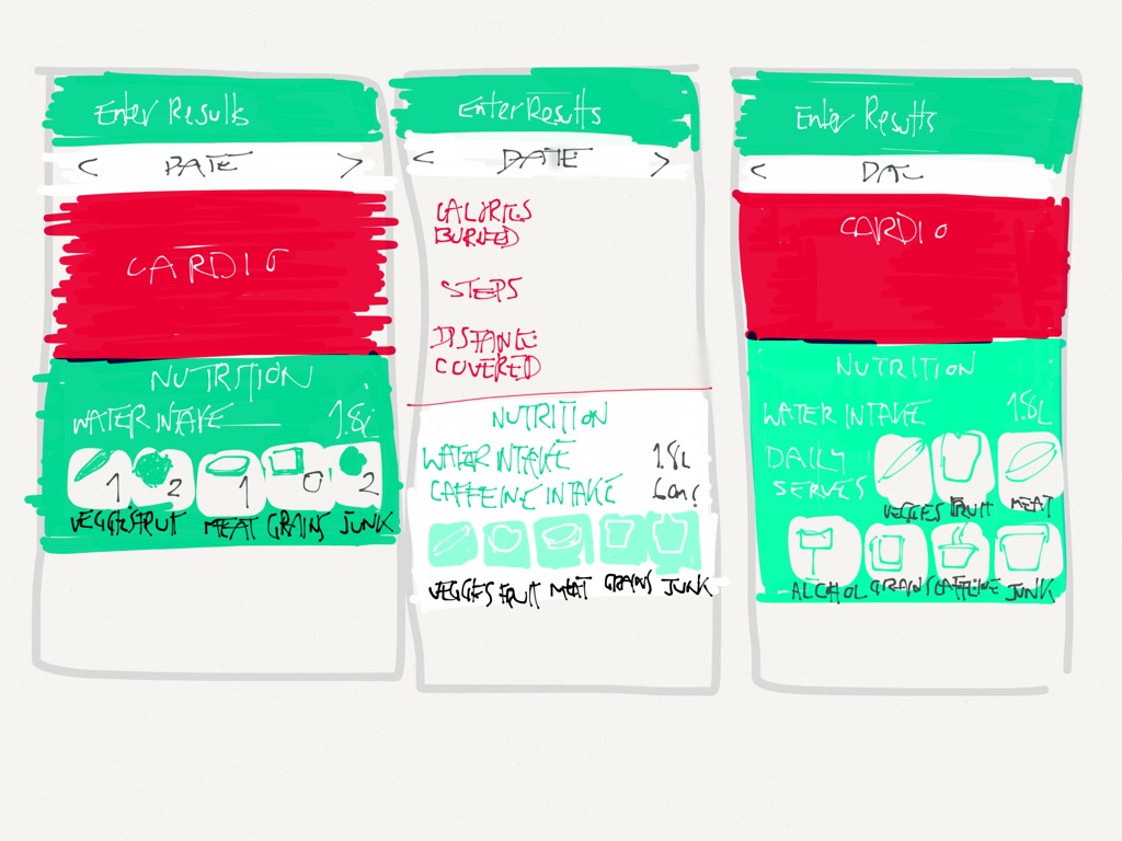
Workout tracking:
Again, this one pissed us off for months. We knew we didn’t have it right. Users wanted to be able to distinguish between types of workouts. If I go for a 15 minute run and hit the gym for 30 minutes that night, I don’t want to simply say I had a workout duration of 45 minutes that day. I want to get the pat on the back for doing something positive twice in one day.
Jerrold engineered a solution that let you track as many workouts in a day as you like, all combining to a total grand tally of your duration. We can split out our analysis by activity as well. That means we can do things like compare your happiness on days that you do yoga, compared to days where you do bugger all.
With users tracking workouts reliably we can match that with other data too. We might be able to predict your likelihood of working out the day after drinking alcohol. We can step in and challenge you to do something you wouldn’t have otherwise done.
It’s not perfect in that technology doesn’t log it all for you but for all but the simplest forms of exercise that you bring your phone with you, it’s a hard problem to solve. We’ll get better at that. Can’t do it all at once right?
Log multiple days at a time:
One of the major barriers to long-term engagement with our app was the amount of friction that users had if they missed tracking it on one day.
An app thats only useful if you use it every single day is suicide in most cases. Certainly for ours, we needed to make it easier to log in a few times a week.
We did a lot of development and testing around the ability to easily scroll through past days data, add it all at once or even just a simple edit of a previous days data
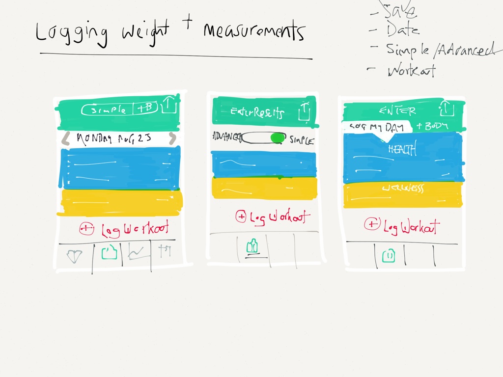
Decluttering:
This one was a hard one to validate with any data. Those that grew tired of logging their health with our app generally couldn’t put a finger on why.
I had a gut feeling that it was because of a cluttered result logging screen.
Again because we’re making the product for ourselves, we picked up that many of the things that you log with your health, you don’t log on a daily basis.
Diet, activity and mood are all things that change and can be influenced on a daily basis. What about your weight, body measurements or strength stats.
I felt that users whether they knew it or not would grow frustrated with glossing over the same questions 80% of the time. Even though I want to use the app to track my weight, I don’t want to do it every day.
The challenge was to make the things that your presented to track on a daily basis, more relevant to your day.
We experimented with simple show/hide toggles but that still leaves a certain amount of clutter.
We looked at taking certain body-related metrics out of the enter results screen and moving them into a fortnightly prompt and push notification to log them.
We tested it but felt that it removed too much power from the user.
After seven variations we decided on splitting out daily metrics and body metrics into separate tabs. The result was that my own personal results screen almost halved in size.
There were things that bugged users. They messaged us on Facebook and wrote us emails with encouragement and sometimes frustration but we worked out the bugs that pissed them off.
We’d used up a lot of their good graces with some Fitbit & Jawbone UP syncing issues so we felt it was important to address the things that they wanted fixed and look after our relationship with them.
Overall we included about 20 bug fixes and minor features that made for a generally far smoother and easier experience.
So, what now?
We try to raise some money so we can work hard on our engineering. The UX needs work but Healthkit integration is more important. There’s still a few bugs. We’ve got the whole personal training product that I haven’t even mentioned. We’ve got a lot to do. We need to raise money. This update is a MASSIVE step forward but we’re still moving too slow for my liking.
We live by user retention.
Are people using our new features?
Are their average session times increasing?
How does user retention differ between users of different versions?
Do our average app store ratings improve?
How does each persona feel about the app post-update?
Is our app better helping to solve the problem that we set out to solve