
Scope:
- Frontend web design
- WordPress backend development
- Technical coordination between a series of specialist developers
Impressive Sounding Shit:
- Re-platformed from eStore to WooCommerce
- Created one-click product generator, saving over a day per week in admin time
Project Scope
Aquabumps is the stage name of Bondi-based photographer Eugene (Uge) Tan. Aquabumps is from the old wave, born before social media and when Google was barely a thing.
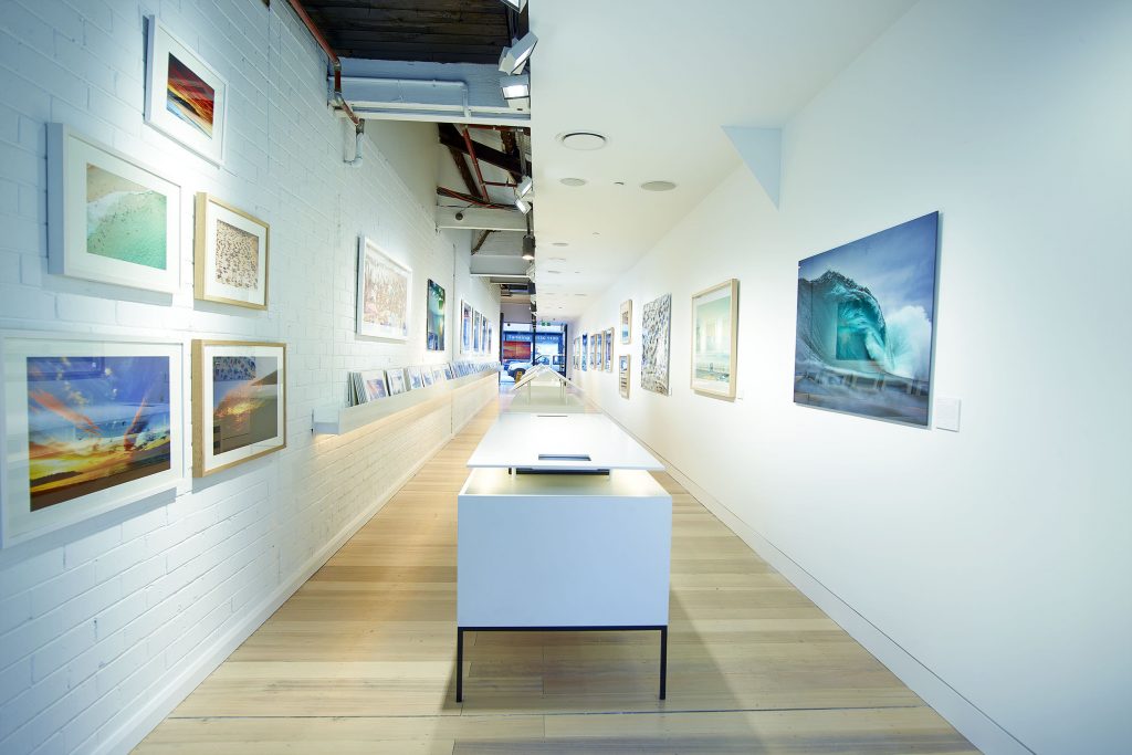
 What began as a blog of photos that Uge took for his mates each morning grew to a daily email read by tens of thousands and eventually to an incredible gallery and shop space in Bondi.
Digitally though, Aquabumps wasn't making the most of their 40k + email database, 100k+ Instagram and 110k+ Facebook audience. 10 years of hacking on top of the eShop WordPress platform had gotten them by but it was time for something epic that enabled the site to go from blog to primary platform of the next stage of the business.
On the side of my job at ZANEROBE, I worked with Uge and the team, re-designing his online store and digital presence from start to finish, re-platforming and developing the new site on WooCommerce.
In this case study I’ll show you the thought that should go into re-designing any large ecommerce site (it’s more product design than web design), how I work and also how WooCommerce can be customised.
Goals
Integrate content and commerce
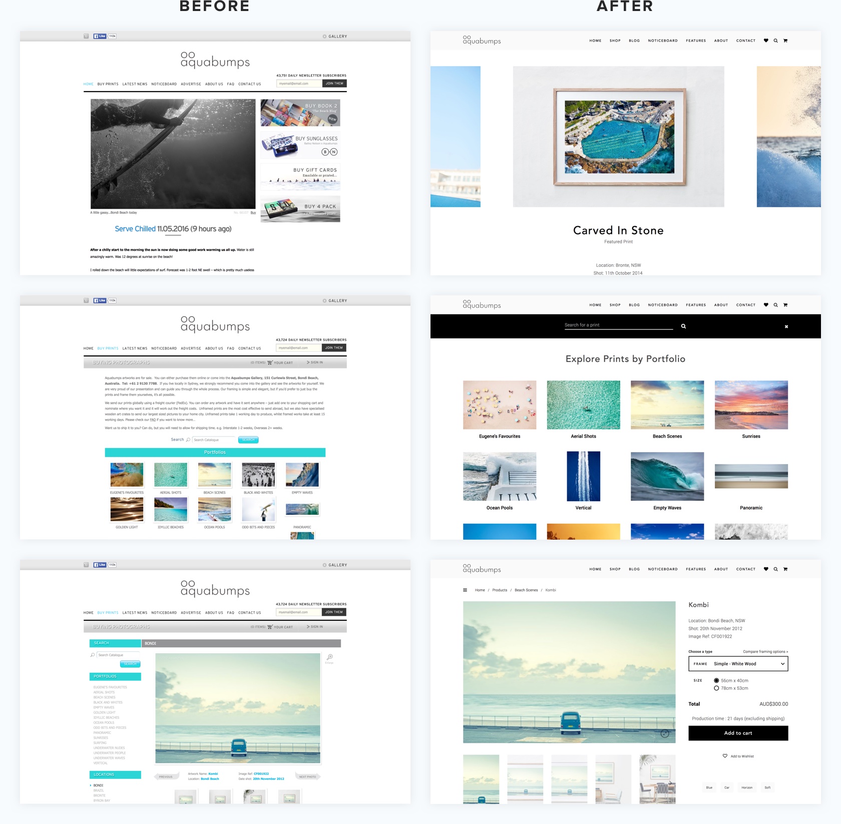
The old site UX revolved around the daily blog. Aquabumps is a morning religion for many, but the business of Aquabumps felt like a separate entity. I needed to redesign the site so that the core following who come for their daily fix of coastal beauty aren't put off, but also so that home-owners all around the world could browse and easily purchase beautiful artwork.
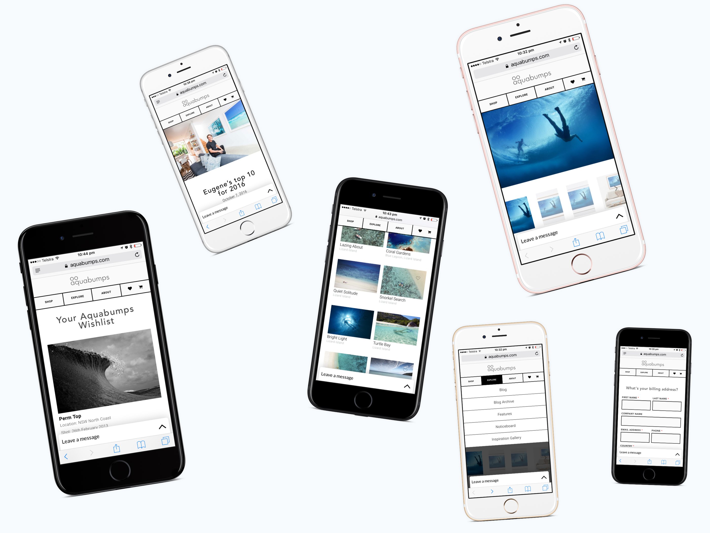
Mobile
With the majority of entry points coming from Instagram or mobile-read email, mobile traffic for a far greater percentage of eyeballs than most sites. With a broad mix of content and 800 products, the site needs to an easy destination to lose yourself for twenty minutes as you head into work or lie on the couch waiting for dinner to cook.
Improve production efficiency
Aquabumps has a production team that rely on every order to run their business. Any decrease in time taken to add a new print, write and email the daily blog post or run the processes that take an order from received on the web to printed, framed and delivered mean some serious dollars saved. Custom software was developed to extend upon WooCommerce and simplify common tasks.
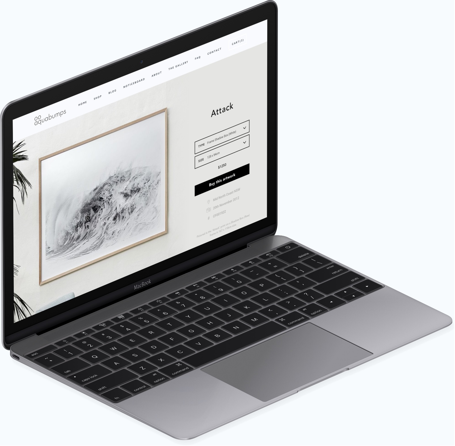
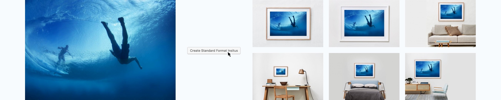
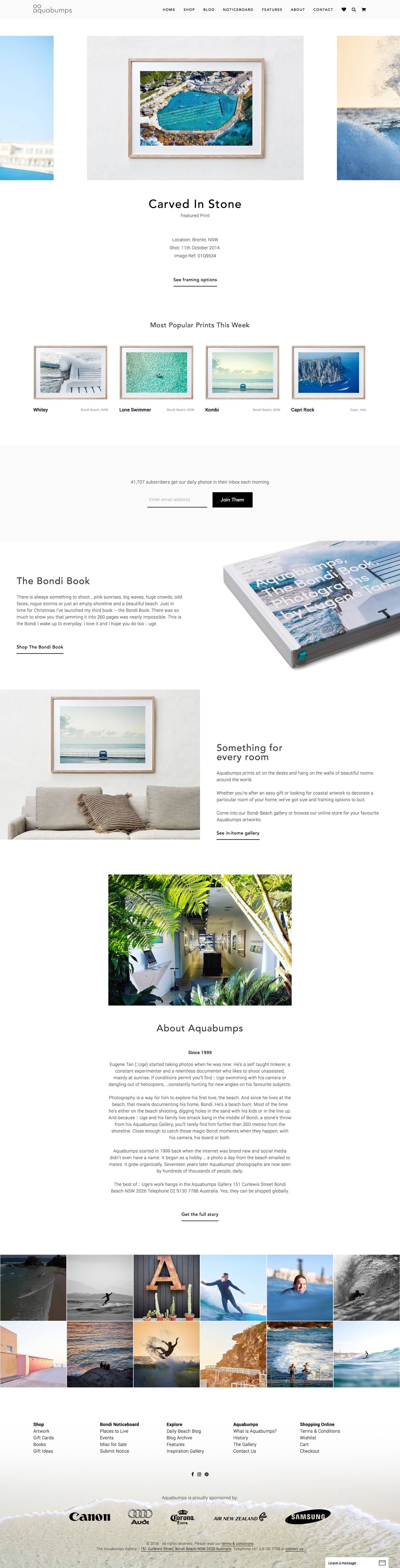
I really wanted to use in situ imagery to entice the user to not merely browse, but to imagine where in their home they would place the print. But, how long do you think it would take to prepare a product for upload if it came in 23 different frame type and size combinations and needed a main image and ten versions to show what it would look like in the home?
We built a one-click product creation, generating in situ images from one image upload, generating SKU from the file name and image information from the image exif data. Not only that, it would create the variation options complete with prices, frame type, size and shipping costs. All up, less than a minute to do what took 20 minutes previously. With 800 initial products and new prints being added all the time, that seriously adds up.
Improve storytelling of the Aquabumps brand
Is Aquabumps a marketplace or one persons photographs? How long have you been doing it or are you just another Instagrammer? Are your photos edited or pure? The old site did little to build Aquabumps as a brand so Uge and I worked on new content to fix that.
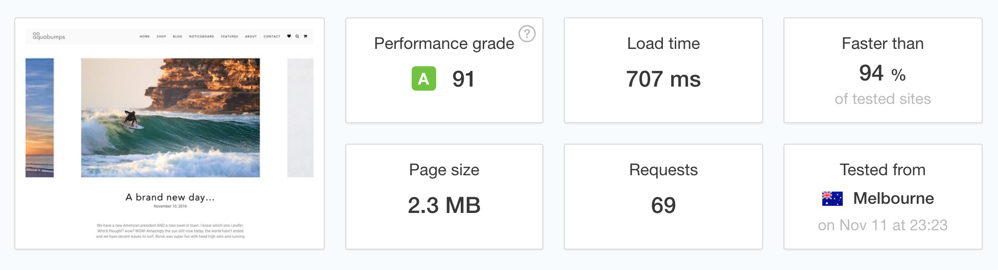
Fast performance
Speed matters and improves conversion rates. It’s easy to design something that looks beautiful but loads slowly. It’s hard to design a photography site that is full of high-res images, looks beautiful and loads quickly. We brought in Ben and the crew from the Code Co to make the server purr. It's a seriously fast website.
Migrate 12 years of content
With a long history, there was a ton of content to migrate. I needed to bring it across while maintaining search ranking and carrying over past links.
Design
Through a strong design brief and then my own analyis of the brand (Uge didn't know prior to our first contact but I've been an Aquabumps customer for years), I put together these design goals and key areas of focus:
- Clean, elegant, minimalist. Don't get in the way of the images and don't overdesign.
- Flexible blog layouts to allow for more editorial content and ways of keeping a readers interest.
- Accessible. Hans, a millionaire from Germany visits one minute, Tommy the 20 year old frother from the Northern Beaches the next, while July, a 65 year old lady from Victoria who's hard of sight and not used to online shoping is buying a birthday gift for her son.
- Amazing checkout flow. With high value items, a large variety of framing options as well as complex shipping, a suboptimal checkout would mean thousands of dollars down the drain each week. We focused on constant access to key information as you scrolled, a frictionless checkout and transparent delivery times based on product type, your location and shipping options
- A beautiful product page UX. Minimize clicks to explore and purchase while providing easy access to framing and shipping information. We played around with a few different designs here and settled on something less likely to win a design award, but 100% functional for their diverse audience. At the heart of it was the use of in-situ photos and product dropdowns that minimized clicks and wasted space.
- Clear buying information. Aquabumps artworks and framing is world class, not a $100 print from Ikea. At their pricepoints customers need to be 100% certain, getting the right information at the right times. Framing options, delivery, warranty, production time and the history of the brand are all communicated throughout the site in the appropriate stages of the user flow.
- Irresistable. Anyone that walks into the Curlewis Street gallery dreams of an Aquabumps print in their home. Through experience, copy and great creative we wanted the online store to create that same desire.
- Mobile UX. Most mobile sites suck. They might contain the right information, but navigating through it all and feeling confident about making a purchase is tough.
- Gift-card friendly
- Every touch point custom designed, from landing page to email receipts, invoices and thank you pages.
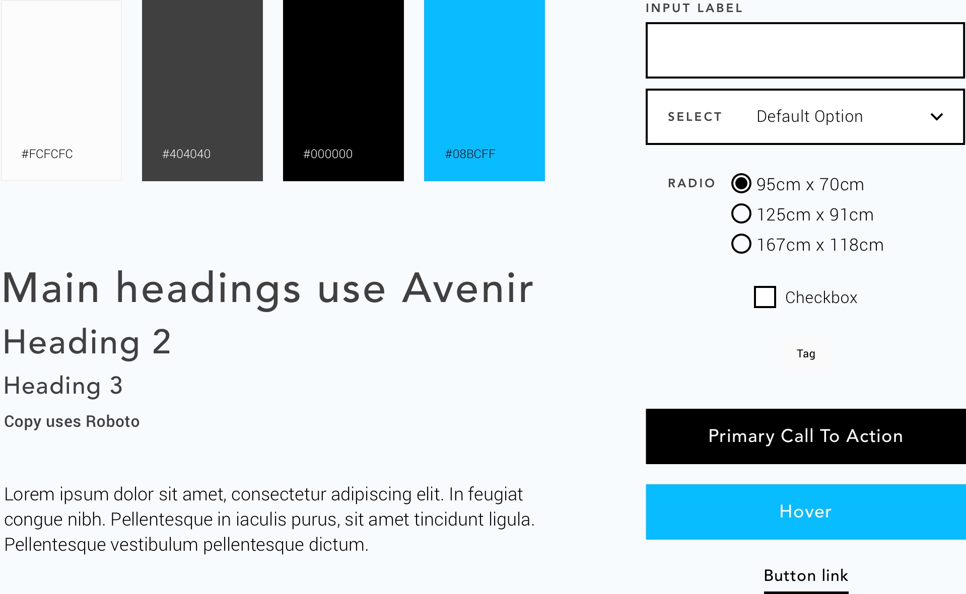
Style Guide
Tech
Built on WordPress + WooCommerce
I developed the theme from scratch with some loose framework from Underscore
Server engineering by the Code Co
Pulled in some developers here and there to help me create some of the more specialist functionality.
This is a site with incredible levels of customisation, most of which is in the backend to suit their business. We’d have been able to achieve 10% of the result on Shopify and Magento would have cost hundreds of thousands more. I’ve really got to thank WooCommerce for making such a customisable ecommerce platform that someone like Aquabumps can build a business on top of at an affordable price. Thanks Woo!
Closing Notes
We can’t finish on the boring stuff now can we? It really was a fun project with an engaged client. There are hundreds of individual product design decisions that have gone into the site you see today.
Always presenting a different form of content in the user flow to keep you on the site, wishlists so you have a valuable page to come back too if you weren’t ready to buy, line by line Aquabumps history to make you more engaged with the story, fixed key content in checkout and product pages so you don’t have to scroll back up to progress – it all adds up to an effective project that is so much more than a ‘re-design’. Thats ultimately what any web project should be and I encourage brands to think well beyond how it looks.